


The year is 2020. In theory, we all know that a fresh-looking expo stand will help us connect with more partners, a fast and functional website will score more leads, and a shiny new UI will attract more customers to our product. A lot has been said about it, and for those easier convinced by numbers, there are numerous studies on the topic. For example, according to The Design Council research, revenue turnover growth is more likely for businesses that increase their investment in design. The study called “Trust and Mistrust of Health Sites” describes user behavior when participants, asked to determine whether or not they trusted a health website, were 15 times more likely to distrust a site due to design issues than the actual content.
Yet, the general understanding of what constitutes good design is still lacking. When asked about it, many resort to describing personal aesthetic preferences. Even professionals in the field often talk exclusively about visual appeal. While appearances are important, there are many other design aspects that shape customer experiences.
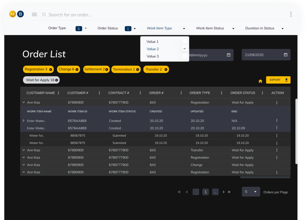
Just recently the MaxBill team had the pleasure to work with one of the largest Telecom providers in Europe to improve our Order Management product module using a different front end technology. This experience led us to revisit the fundamental principles of design.

Designing a Solution, Not an Art Piece
Customers mostly seek a particular product because it solves their problem or satisfies a need. They can be attracted to a shiny pretty interface from the get-go, but what makes them commit to the purchase is ultimately the functionality. Therefore, the main mission of a good design is to help the client achieve their goal as fast and effectively as possible.
Big breathing spaces with a low number of items in sight, sharp, easy to understand fonts and clean defined edges are here to serve a purpose. Ideally, it is much easier to navigate any space if presented with limited choice, and each item stands separately. Such a design makes it easier for the customer to decide what they need and simpler to get to it.
Then, any colors and fonts can be applied, following the company’s style guide and the preferences of the customer. The main point is that these finishing touches should be implemented in the final stages.
When, however, the underlying purpose is lost on the designer, the customer gets presented with an unclear message, which is not useful, even if presented in all of the right colors. This accomplishes nothing, as when a user can’t get to the information they are looking for quickly, they won’t care for the attractive picture.
It All Starts With a Question

A client comes to you with “Can your system do X?” or “Where can we look Y up?” You begin to explain, and if takes more than a few words to do so – that’s the time to rethink your system’s design. This is the most important stage of the process – it’s necessary to evaluate, which approach in user experience would be the most suitable. Maybe, just a couple of elements have to be added to an already existing screen or a whole new interface has to be drawn out.
The MaxBill R&D team started the design, by communicating with the customer closely and eliciting how was the existing functionality used, working out a new proof of concept with users, testing new ideas and keeping what works. The end goal was to provide the means to view the ordering summary and, most importantly, have quick access to particular orders that reported some issue.
Simplicity and Unification Make a Path to Success Shorter
We aimed to find the simplest solution to our customer’s needs; so the user would spend the shortest time getting the job done. Consequently, it was decided to build a new front end interface that would enable operational staff to access tools for their daily activities most simply and conveniently. Order dashboard, order lists with a variety of possible filters and export capabilities would give users better control over the operational flow of the company and would allow making faster decisions based on order data.
The truth is, prioritizing all of the needed information and determining the shortest paths between elements is an essential part of the process.
After the goal was achieved, we scraped all excessed information and interactions and were left with a clear plan for the main disposition of the elements on the screen. Considering that we already worked out the style guide for the company and have developed rules for product unification and coherency, tweaking and applying the eye-candy stuff like colors and fonts has been a piece of cake.
Make UX Great Again
There are basic rules people learn in design schools, and there are trends that come into style frequently. There are tricks to be discovered along the professional way of each artist, analyst, or developer. However, there is a way to make your UX truly exceptional – by making sure it works perfectly for your customers. Great design is not cheap, but, as proven by multiple studies, it yields a huge return on investment.
Therefore it’s crucial to get to the “why” first. Get to know the client. Understand their problem. Listen to WHY they need to solve it. Then, follow the gathered information with “how”. HOW can this problem be solved? Has it been tackled before? Analyse similar experiences. Go either through the process of simplifying the existing solution or inventing a new one (and then simplify it). What you arrive at, would be your design’s foundation. It can be then fashioned in ways unique to the particular vision, but the core will remain functional.
Similarly, never neglect the process of the UX evaluation after delivering your product. Get feedback, listen to it and act on it. It doesn’t matter how visually pleasing the final version is if the client finds it unusable. When evaluating, go through the same “why”, “how” and “what” steps. WHY does it need improvement? HOW would you do it efficiently? WHAT will be the end result? For example, we are now live with the order management module update and moving through the tweaking phase for it, to make sure it completely covers its mission.
Following such an approach as a part of the MaxBill process is the reason why our customers trust in our ability to deliver the best solution for them.
Huge thanks to Alexandra Ovcharenko, UX Business Analyst, for valuable insights.